
Over the span of more than 5 transformative years, I dedicated my expertise to redesigning and successfully launching new products within Johnson & Johnson's global skincare brands.
This journey unfurled within the innovative hub of the Global Strategic Design Office (GSDO) – a hyper-creative in-house J&J design studio that brought together brand, packaging, industrial, strategy, and UX/UI designers. Tasked with complete ownership of design, I collaborated seamlessly with J&J's marketing, R&D, engineering, and production teams, as well as external vendors and major manufacturers on a global scale, working on top-selling skincare/beauty brands, including Clean&Clear®, Aveeno, Lubriderm, Biafine, and RoC. This encompassed a wide spectrum of responsibilities, ranging from spearheading international brand redesigns to conducting in-depth design research. In alignment with strategic sales targets, I honed my craft to design custom packaging concepts and innovative ideas for primary and secondary packaging. My dedication to maintaining brand consistency was evident as I skillfully amplified the distinctive voice and graphic language that encapsulated the essence of each brand, deeply resonating with consumers. My role extended beyond the design studio to the pressroom, where I meticulously approved final print quality for high-stakes product launches. Eventually I took on a leadership role, with my primary focus centered around the iconic Clean&Clear® brand. Fueled by consumer insights, I pioneered unique line extensions for the US market and propelled the brand's expansion across the dynamic landscapes of Asia's emerging markets. In these culturally diverse and nuanced environments, factors such as local culture, unique skin types, and distinct shopping experiences played a pivotal role in steering our strategic design trajectory. This immersive experience at J&J not only enriched my understanding of the design process but also solidified my commitment to delivering excellence at every stage, proving my adept time management skills to ensure that each endeavor was executed with precision and delivered on time.
This is a collection of selected products I proudly designed, collaborated on, and meticulously oversaw the printing process to guarantee that every color, varnish, and transparency materialized precisely as envisioned.
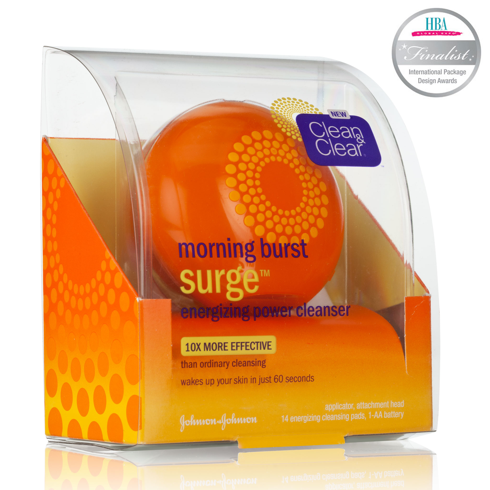
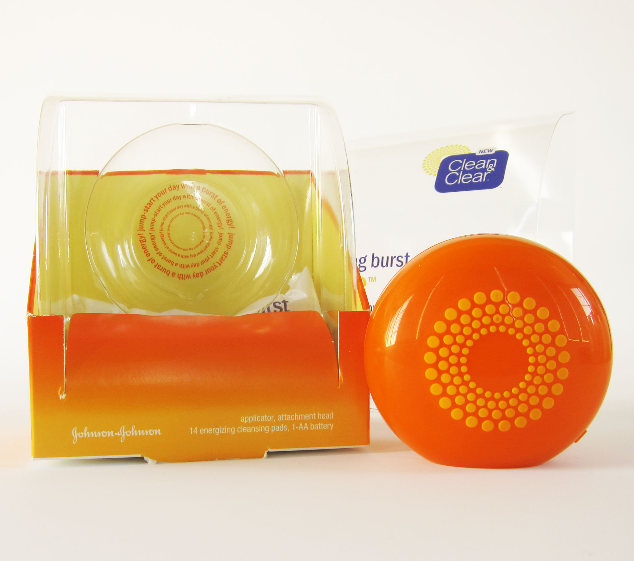
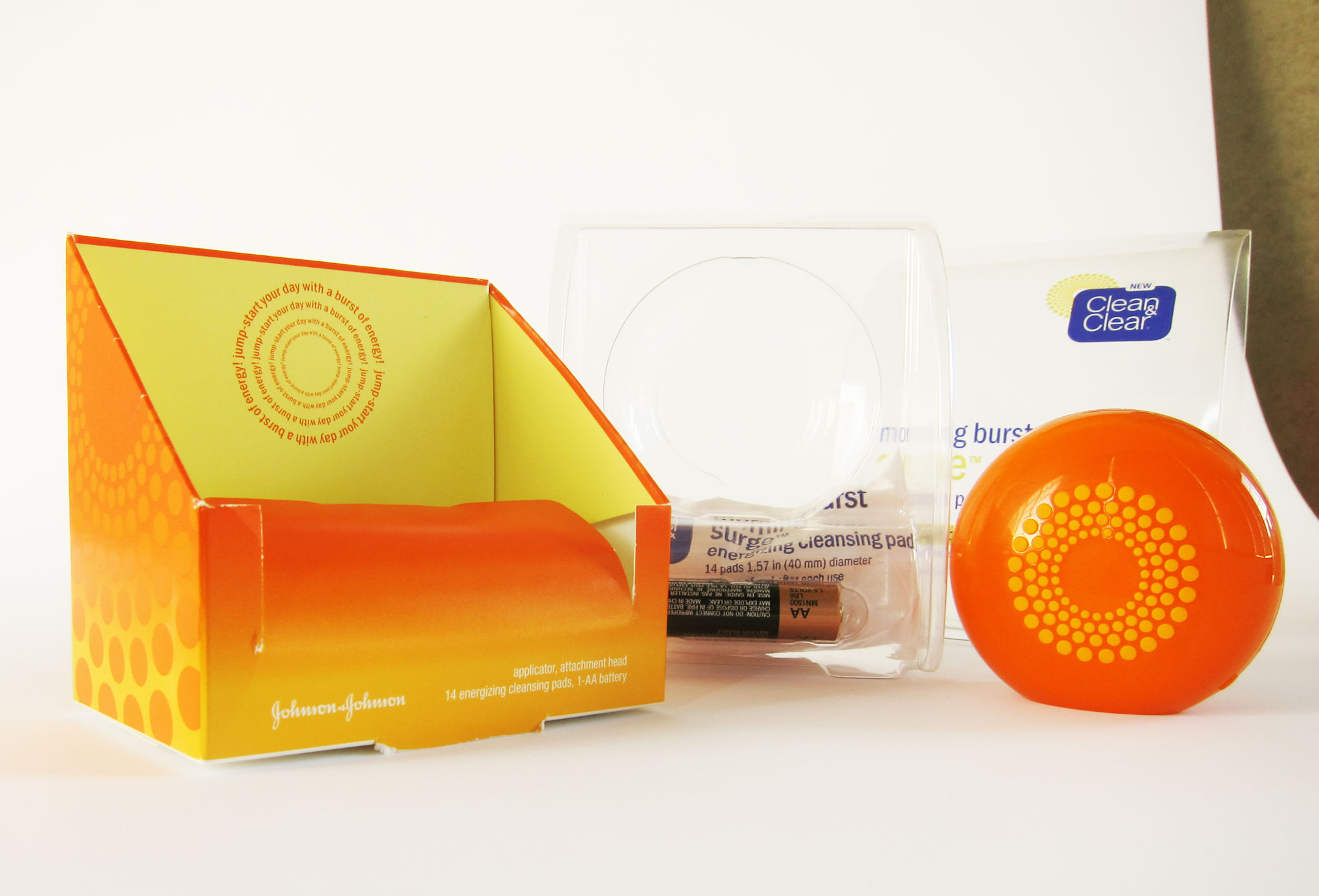
Clean&Clear® Morning Burst® Surge
An
ingeniously playful
all-in-one creation
SECONDARY PACKAGING DESIGN
LAYOUT DESIGN
COLOR AND VARNISHES
PRESS CHECK
PLATFORM VISUAL IDENTITY
PACKAGE DESIGN FOR MULTIPLE SKUS AND SIZES
PRINT TRIAL APPROVALS
COLLABORATORS:
JENNIFER DAHL, CD
Prepare to be captivated by this delightful device, a testament to the creativity of our in-house industrial designer. Collaborating seamlessly with our engineering partners for the secondary packaging, we designed a range of concepts that encapsulated uniqueness, cost-effectiveness, and eye-catching aesthetics for the exterior packaging. Sustainability and theft-prevention were integral to our design ethos.
The final package showcased here achieved remarkable recognition as a finalist at the esteemed HBA International Package Design Awards. Moreover, it boasts a patent from the United States Patent and Trademark Office, where I am officially recognized as an inventor!
The final package showcased here achieved remarkable recognition as a finalist at the esteemed HBA International Package Design Awards. Moreover, it boasts a patent from the United States Patent and Trademark Office, where I am officially recognized as an inventor!


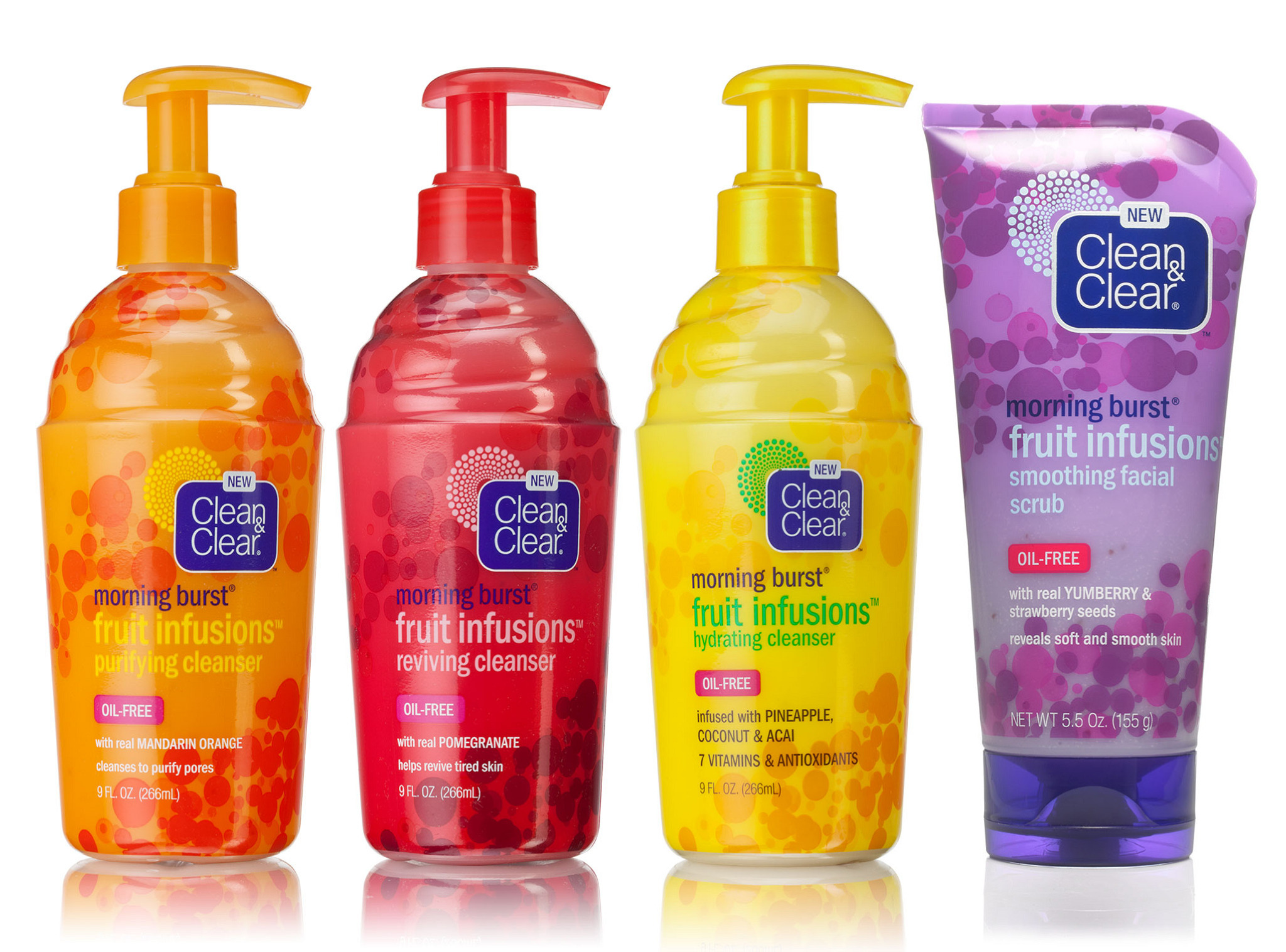
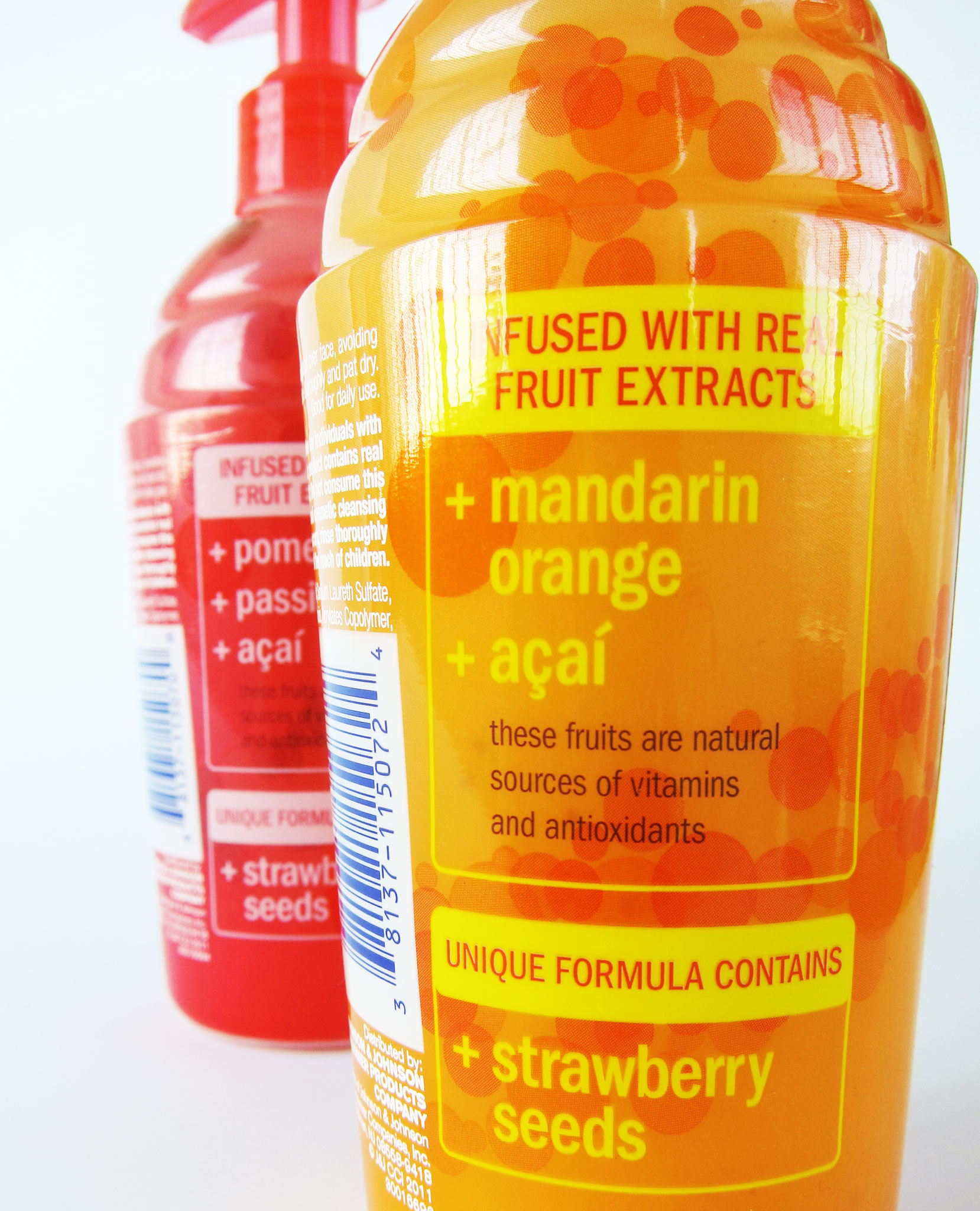
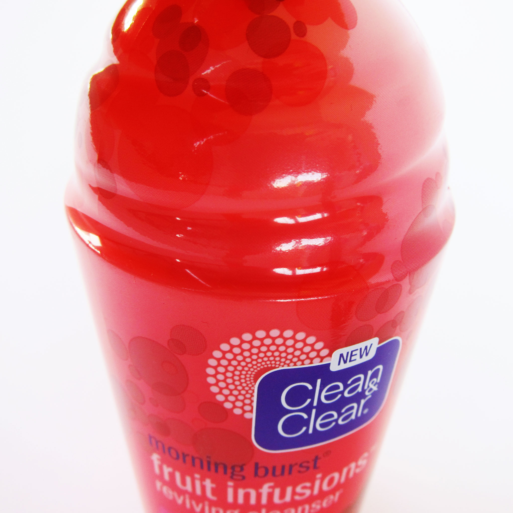
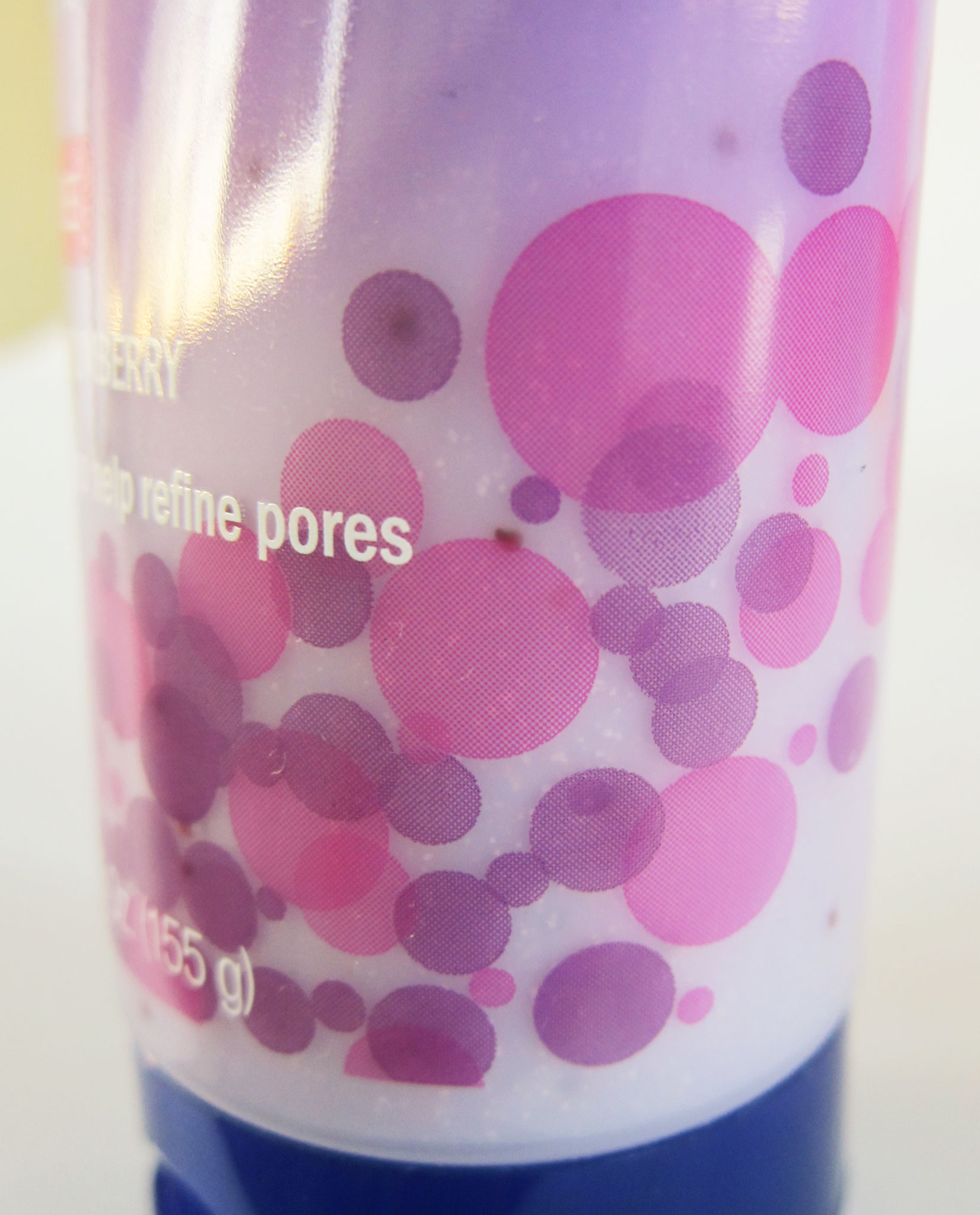
Clean&Clear® Fruit Infusions
Unveiling
youthful freshness:
A dynamic
sub-platform
INFORMATION ARCHITECTURE
LABEL LAYOUT DESIGN
COLOR AND VARNISHES
PRESS CHECK ON SHRINK WRAPS
Revolutionizing skincare for young teens, Clean&Clear® introduces a dynamic sub-platform rooted in a key insight: a desire for natural fruit ingredients. Embracing the brand's playful and vibrant essence, we crafted this platform to embody youthful spirit while effectively highlighting the efficacy of fruit-infused benefits. The graphics celebrate blended fruits, seamlessly extending the MORNING BURST® platform's visual language. Complementing this, the bottle structures, inspired by blended smoothies, offer a custom design that perfectly merges functionality with the brand's fun energy.
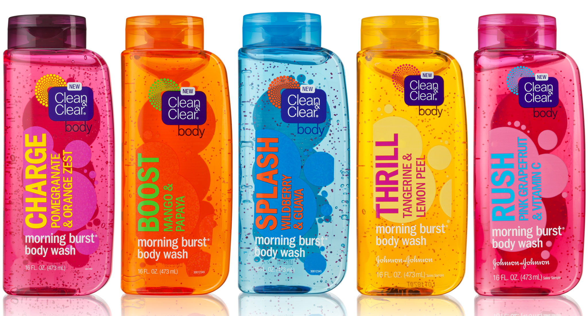
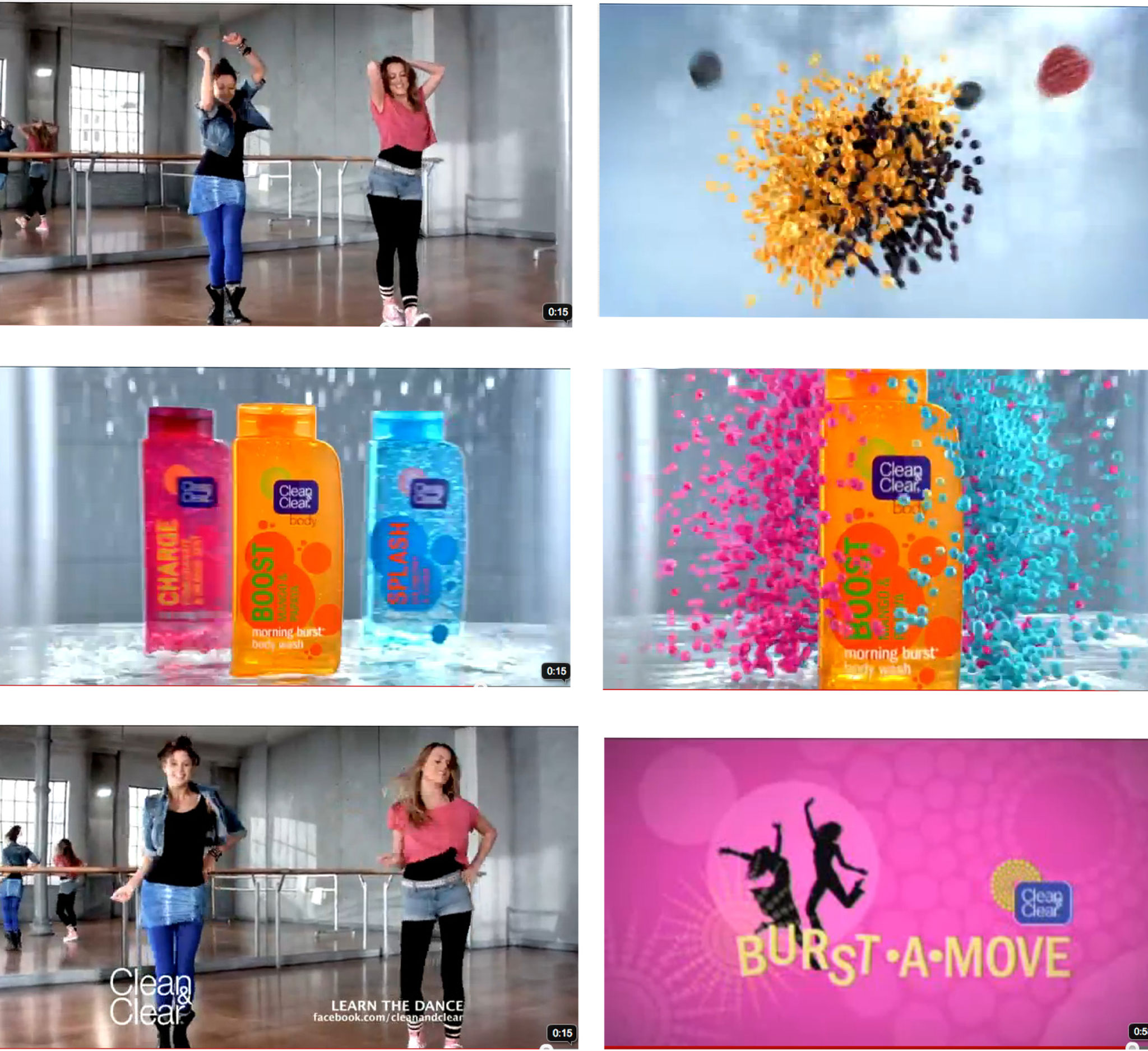
Clean&Clear® Morning Burst® Body Wash
Revolutionizing Clean&Clear®: propelling the brand beyond skincare
INFORMATION ARCHITECTURE
LABEL LAYOUT DESIGN
COLOR AND VARNISHES FOR BOTTLES, CAPS & LABELS
PRESS CHECK ON LABELS
Prepare for a journey beyond the familiar as Clean&Clear®, a leader in teen skincare, ventures into uncharted territory: body wash. The challenge? Transforming a daily shower into an energizing ritual. The inspiration? The resounding desire for a revitalizing wake-up call. The outcome? A groundbreaking line of body washes that resonate with bold, vibrant colors and youthful typography. With a dash of audacity and a dose of adherence to brand integrity, we've crafted a collection that not only stands out in the crowd but also captures the essence of invigoration – all while staying true to Clean&Clear®'s vibrant identity.


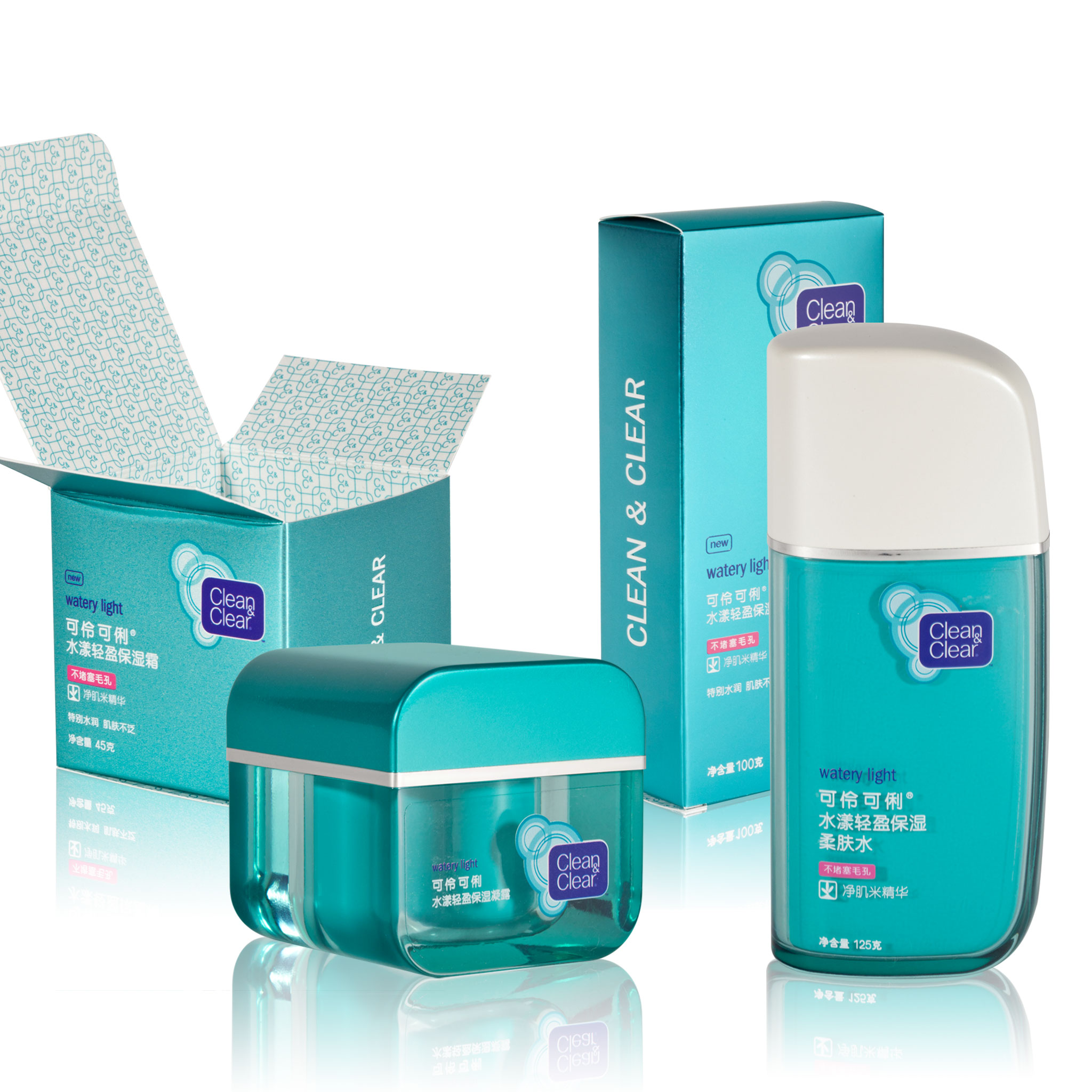
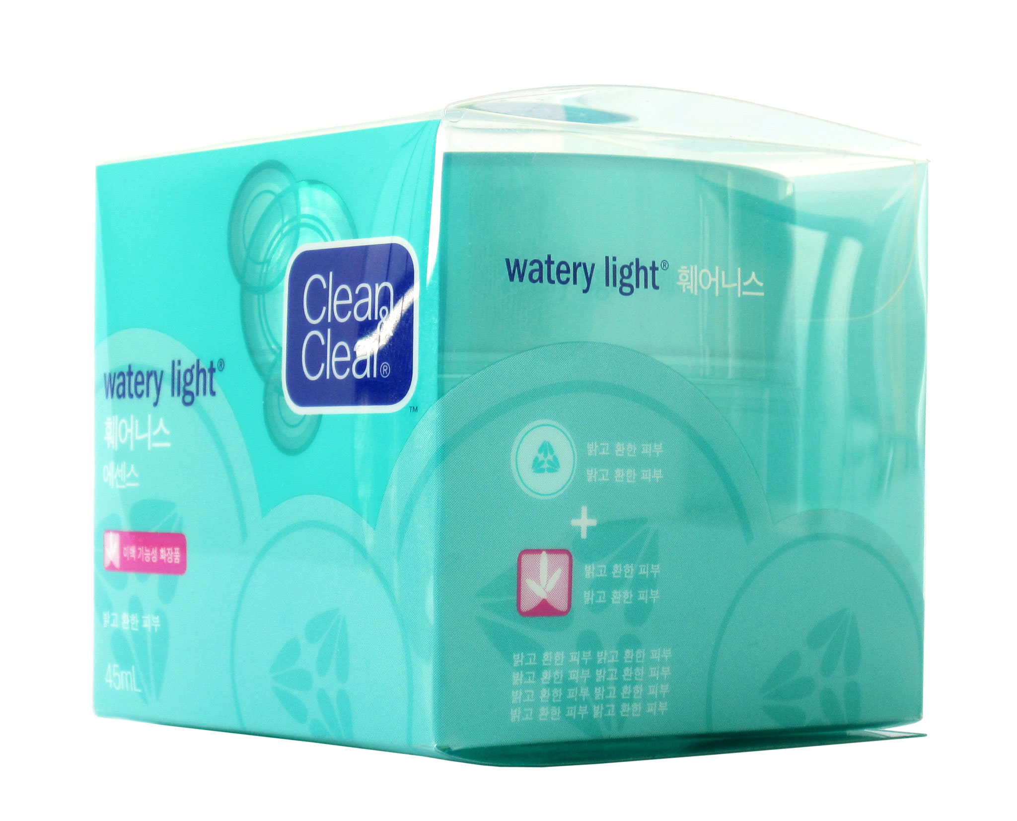
Clean&Clear®
Launching in emerging markets in Asia Pacific
DESIGN STRATEGY
DUAL LANGUAGE INFORMATION ARCHITECTURE
LABEL LAYOUT DESIGN
COLOR DIRECTION FOR BOTTLES, CAPS & LABELS
In 2011, CLEAN & CLEAR® entered the Asia Pacific mass marketplace with strategic boldness and most importantly, cultural awareness. Amidst the proliferation of Western brands, transparent communication of natural ingredients on packaging has emerged as a pivotal design strategy. Collaborating closely with the Design Director and regional marketing and engineering teams, I crafted packaging and graphics that strategically amplify the "active" ingredient in a bold manner, all while adhering to CLEAN & CLEAR®'s distinctive visual style. In the Korean market, embracing a "kawaii" aesthetic and premium beauty sensibility is paramount. Conversely, in India, where skincare products are situated in bodega-style spice shops, vibrant colors and graphics are designed to effortlessly catch customers' attention from afar, ensuring confident shopping experiences.

RALUCA PREDA 2023